
LAYS MAXX KV
About the project.
The challenge
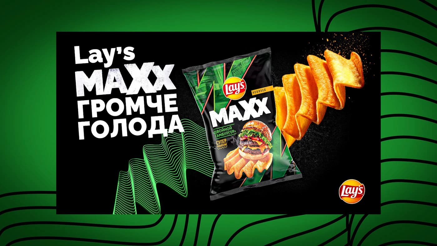
Announce the launch of extra-ridged Lay's MAXX so the visual conveys not flavour but loudness — the range's core promise.
The solution
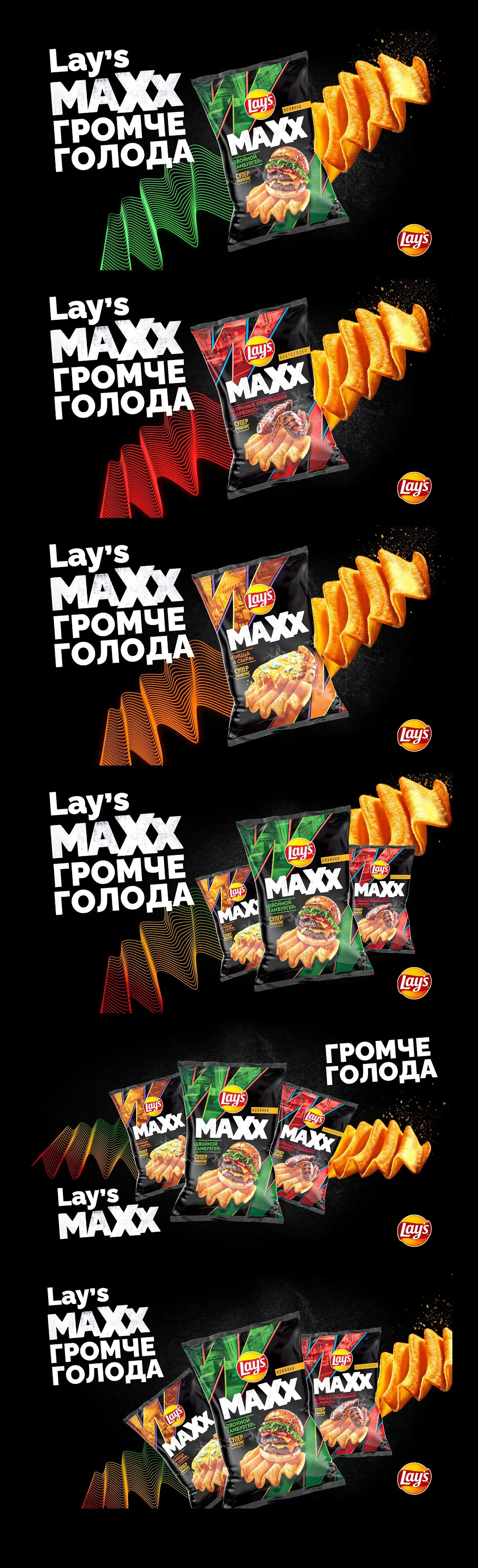
We took the line «Louder than hunger» literally: sound waves built from thin green lines run across the frame while oversized ridged crisps fly out of the pack trailing seasoning. A black-and-green palette separates MAXX from the core range, and the Double Burger packshot holds the centre of the composition.
The project in detail
Project details
- Format
- Graphic
- Category
- Graphic Design
Behind the work
The loudness promise is translated into waves, product movement and a dark high-contrast palette. Flavor stays readable on pack while the scene sells the line character.
What carries forward
A launch becomes easier to adapt when background, type and movement all express one product property.

Let’s discuss
your project
Tell us what you want to do — we’ll suggest an approach and next steps.
+998 91 856 91 96