
REBRENDING LOGOTIPA
About the project.
The challenge
Rebrand a mark so the new version reads as an evolution of the old one rather than a swap for someone else's symbol.
The solution
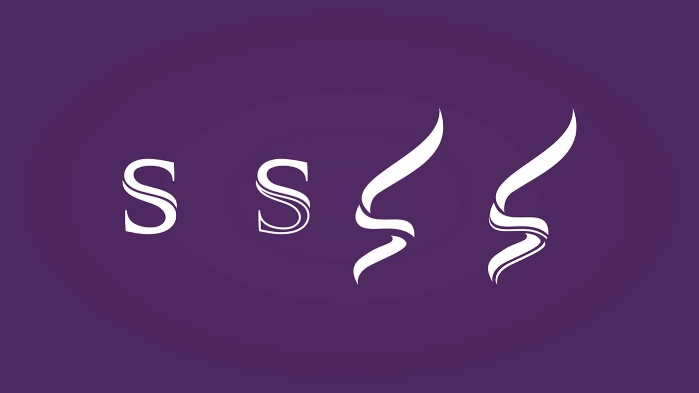
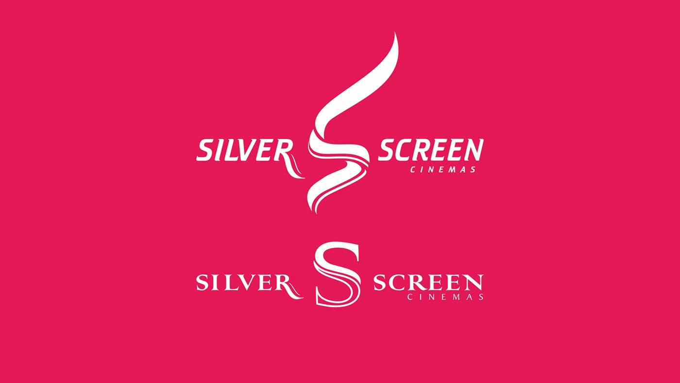
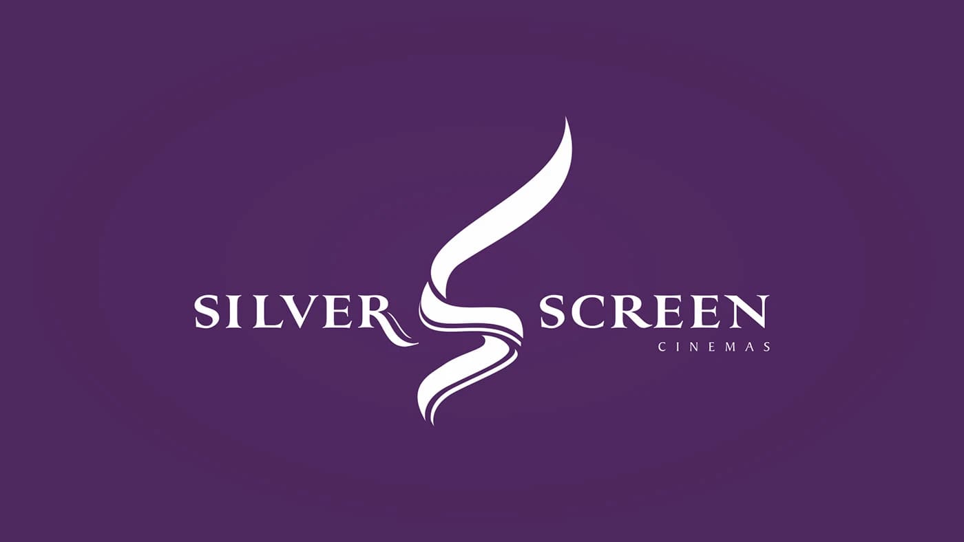
We laid the transition out in four steps: from a classic serif S with a flourish to a calligraphic line where the letter keeps its angle and pivot but loses literalness. The final mark works as an abstract symbol — recognisable at small sizes without a wordmark — while the intermediate stages make the logic of the shift legible in review.
The project in detail
Project details
- Format
- Branding
- Category
- Branding


Let’s discuss
your project
Tell us what you want to do — we’ll suggest an approach and next steps.
+998 91 856 91 96